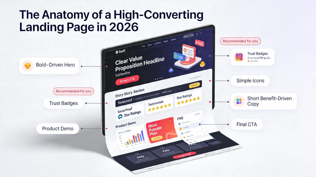
A high‑converting landing page in 2026 is less about “looking fancy” and more about ruthlessly guiding one visitor toward one action. Think of it as a conversation, not a brochure.
Start with a hero section that does three things in seconds: states a clear outcome‑driven value proposition, shows quick social proof, and presents one obvious CTA above the fold. From there, the page should read like a story: problem, proof, solution, then risk‑reversal (guarantees, FAQs, and friction‑free forms).
In 2026, your biggest unfair advantages are speed, focus, and personalization. Mobile‑first layouts, fast load times, and distraction‑free design (no competing nav links) are now table stakes, not “nice to have.” Layer in AI‑powered personalization and dynamic sections that adapt to intent, and you dramatically lift conversions without adding clutter. The real anatomy of a winning page: one promise, one path, and zero confusion